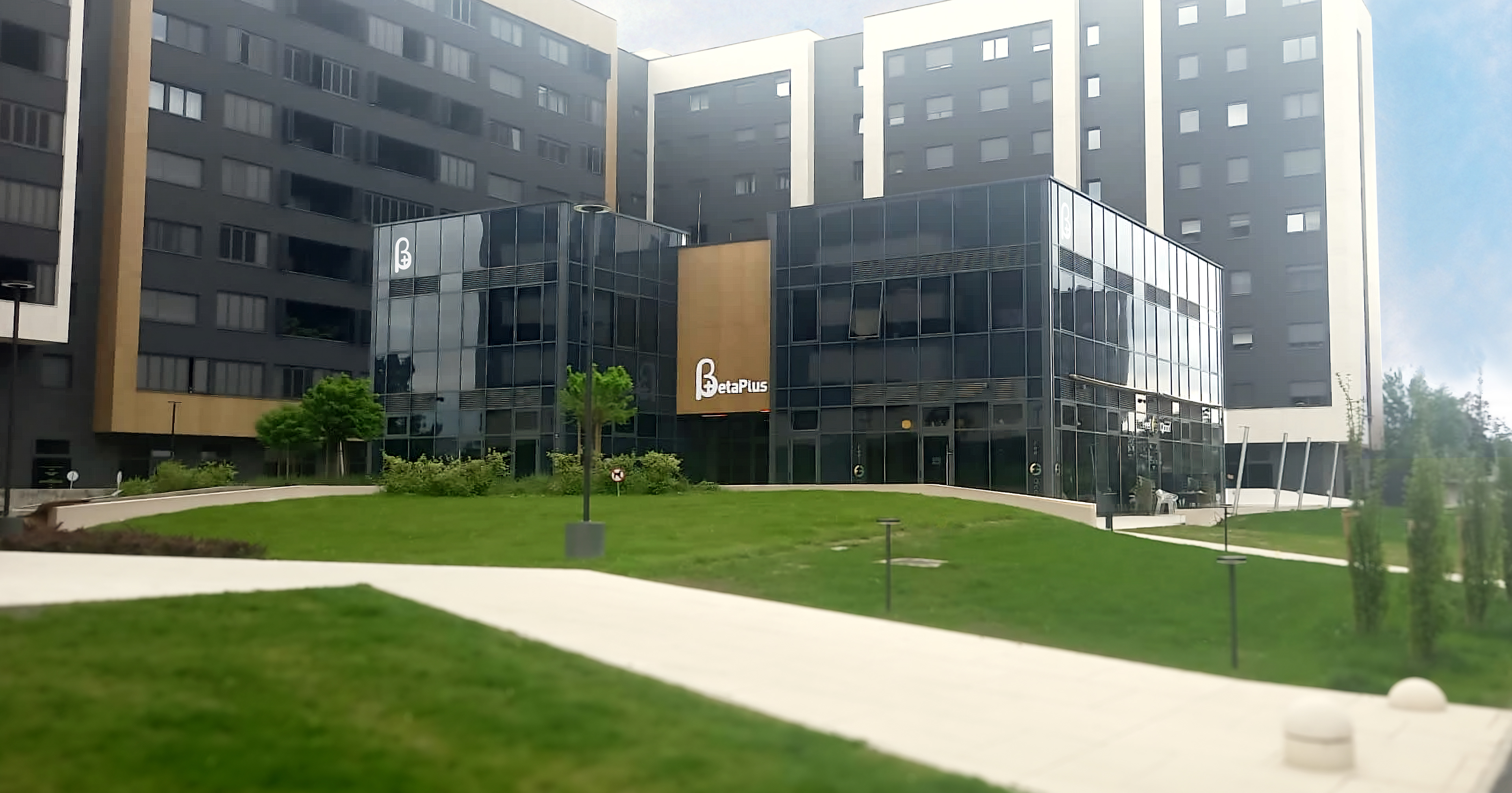
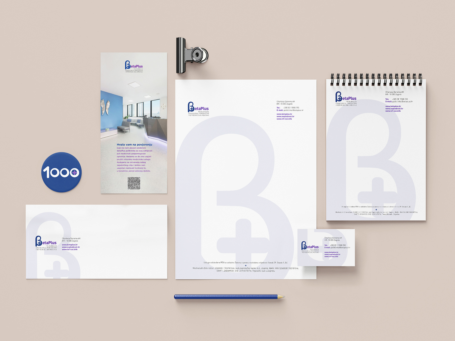
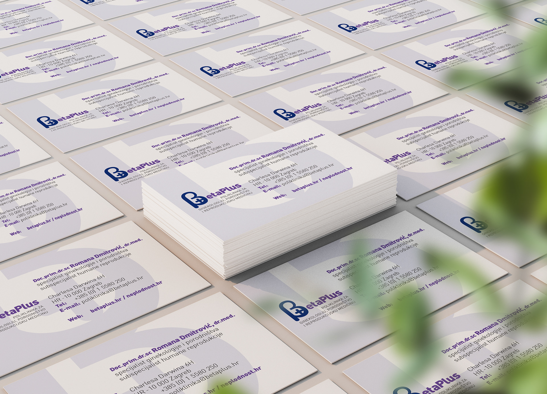
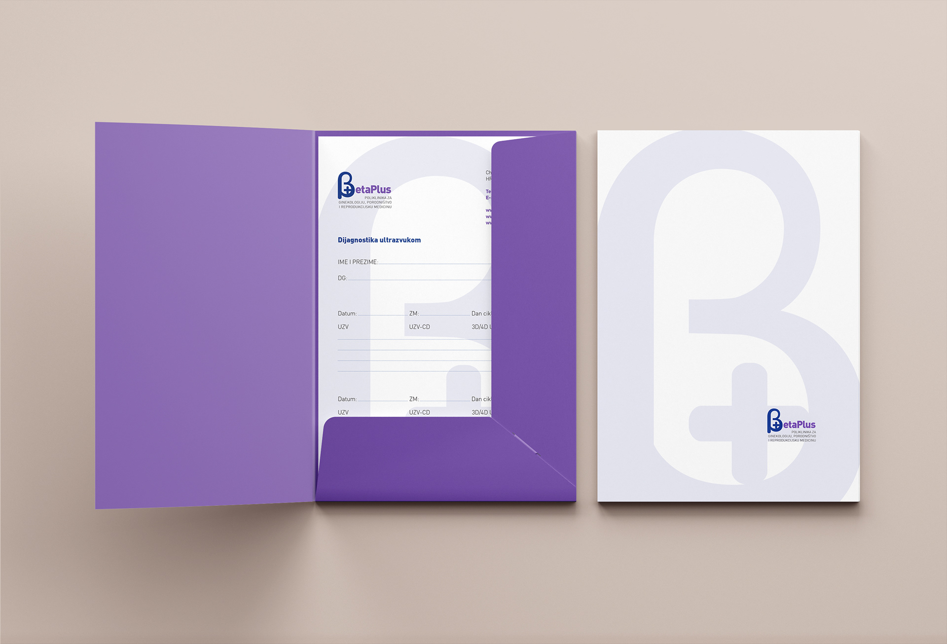
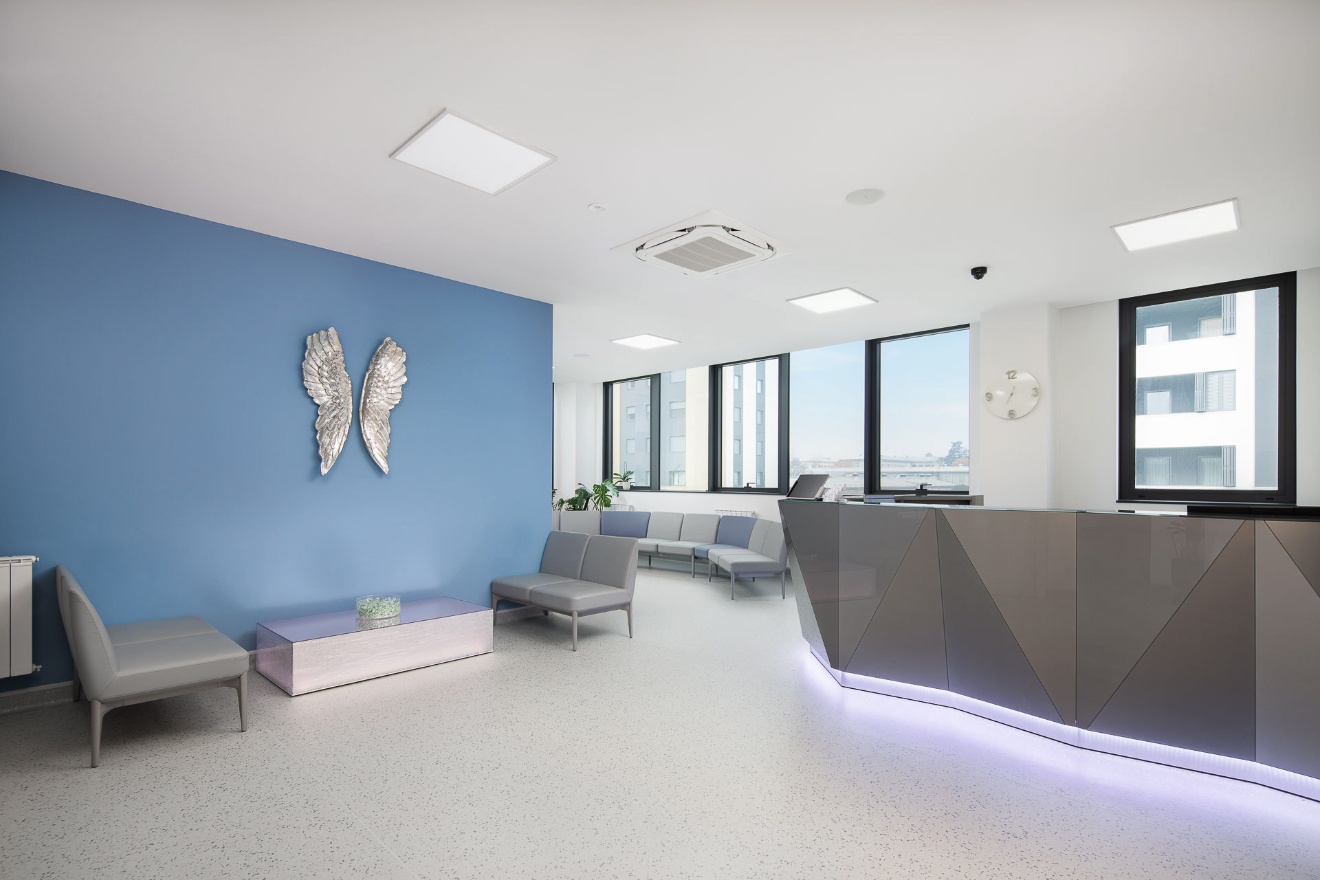
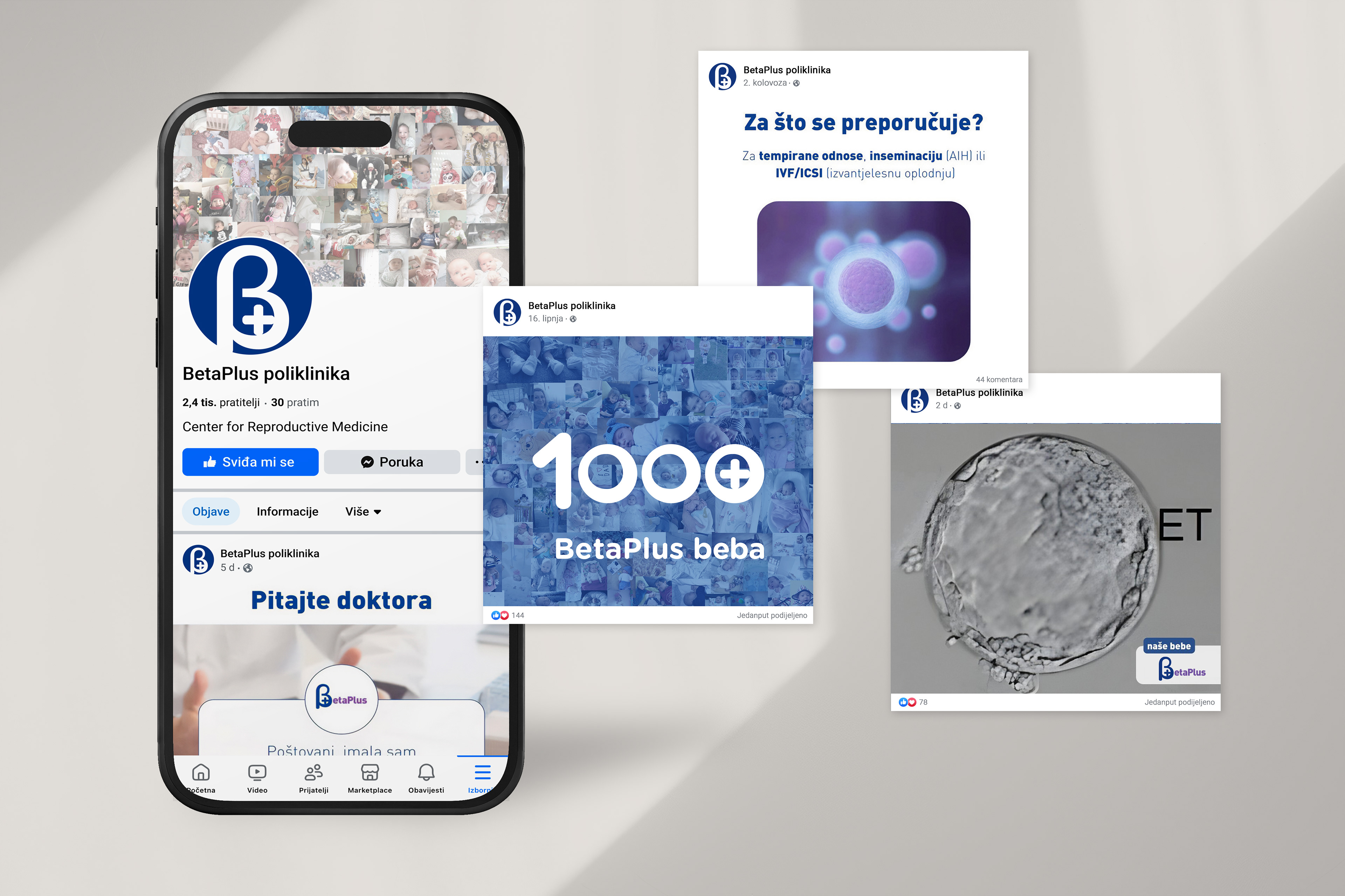
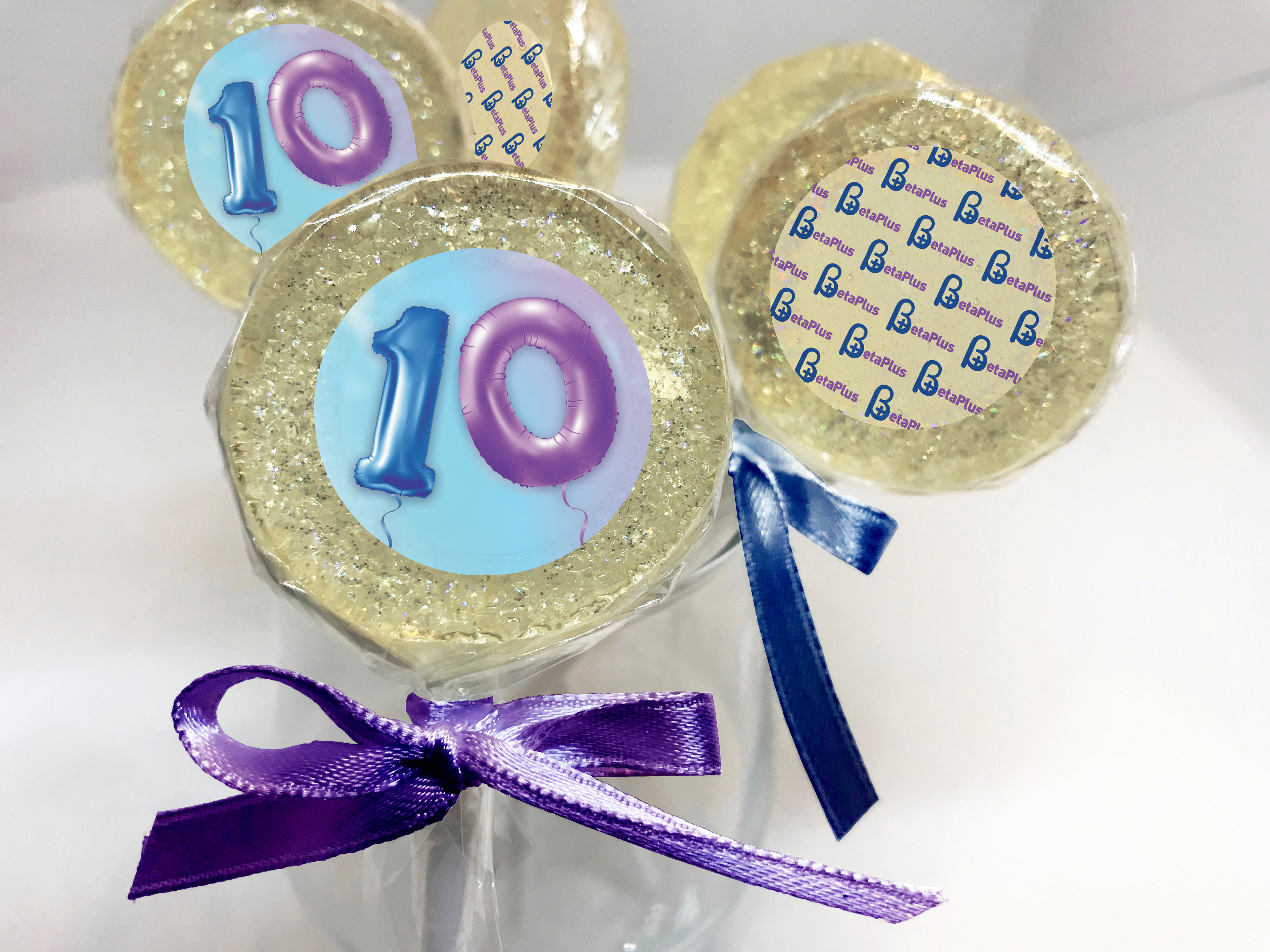
When the BetaPlus logo was designed, my client and I had longevity in mind. BetaPlus is a center for reproductive medicine, where care, patience, and belief are essential for success. Bold typography communicated my client’s vision. The branding developed gradually, in step with the growth of the business. We paid close attention to every detail and built the brand with the same dedication that guides the patients at BetaPlus. First, we created correspondence materials, then we modestly marked the fifth anniversary, followed by a more refined celebration of the tenth. When BetaPlus moved to a new location, signage was introduced both outside and inside the building to strengthen recognizability. In 2026, BetaPlus will celebrate its 15th anniversary, stronger than ever.